Think contemporary !
A house the colour of sand signed Philippe Caron, at Super-Cannes.
A house the colour of sand signed Philippe Caron stands out clearly on the hill of Super-Cannes. Guided tour…
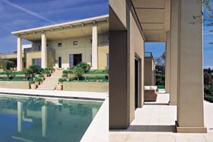
When you think that the contemporary style accounts for a mere 0.2 % of building permits applied for on the Riviera, you realise just how rare this property is. It rears up proudly, facing the sea, Golfe-Juan and Cap d’Antibes. You’re hardly past the gate when the tone is set. A drive of impressive sobriety, a door, sombre and metallic. Even if you have an intuition, the monumental proportions only hit you once you’re inside. Vertiginous space, lofty proportions… One’s gaze gets lost, to be quickly saved by the geometric structure. The lounge is the centerpoint : a ceiling 9 metres high, immense picture windows, a gigantic sunlight, small windows set high in the walls, loopholes providing symmetry. The light streams into the room, magnifying it and giving it all its powerfulness. Recesses on each side : the most obvious, to the right, leading to the dining-room. You hardly have time to take in the room because your eye is drawn to the kitchen : storage elements everywhere, electrical appliances like works of art, a central island, liberal use of stainless steel, shades of black and grey in contrast to the virginal white extractor hood. Left of the lounge, you make out the home cinema area through a gap in columns wider than the spaces in between.
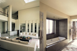
This initial tour enables you to identify the purpose of each room. Back in the centre of the building, you analyze its structure. Three steps leading to the lounge, recesses and windows of different shapes and sizes, a sloping ceiling, pierced to let you see the sky, columns adding rhythm to the perspective while throwing it out of kilt… The use of colour is both austere and warm, black floors in Mont-Ventoux stone, bright everywhere elsewhere. In fact it’s from the upper floor, from the gallery which runs the whole length, that the architect’s work is best observed. Walking round a concrete form, you guess at a room, a second and a third, rather like a loft that runs on to infinity. Deliberately, nothing is being said about interior decoration, for the layout in itself is the property’s primary asset. All styles would suit, as long as they are at ease in a monumental setting. You wouldn’t go for a plethora of objects and furniture, rather a refined selection. The immense walls serve as exhibition space intended for the brightest paintings. One immediately thinks of phallic sculptures to pay tribute to the loftiness of the setting. As for furnishings, the ’seventies would be appropriate in their lightest version, or a frankly contemporary style with pure, airy and geometric lines. The first floor is comprised of four bedrooms and three bathrooms. And as night-time calls for more warmth, stone is here replaced by dark wood. Though the master suite echoes the ground floor : the same concern for space and openness. Faultless taste.
“Too cold,” will say those who rebel strongly against any evolution in style. “So obvious,” one is forced to admit. They resist in the name of harmony with the surroundings, but isn’t this contemporary architecture in fact the answer ? The outside penetrates the residence through each window : Mediterranean shrubs and plants, the sea and the very beautiful cape…
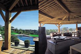
No more hesitating, you step outside onto the immense paved terraces, vital to the house’s general sense of balance. Lower down, the pool melts into nature : its green, black and grey mosaic is very fashionable but unfortunately not widely adopted. Then, there’s a different world, both colonial and modern. Lots of wood, with sturdy beams and metal rails. A lounge within the park, open to the wind, totally original. A disconcerting blend of tradition and contemporary taste. A few steps into the garden, mesmerized by the sublime view. About turn… And one discovers it finally and for the very first time. The main building, a real ship against a backcloth of greenery. Two immense columns, two more set further back, supporting an impressive roof. The construction advances at the level of the dining-room and home cinema to withdraw before the lounge. Cubic expanses, squares and rectangles in clever relief, a series of Roman-style mouldings, doors with strips of black aluminium. From the side, the symmetry is even more reassuring : a terrace, an empty space, a terrace and that long row of columns, guarantors of majesty. One takes in the whole, the details, to be left only with green and blue, the garden and the sea. The house has not sacrificed the art of living to purity of design : priority goes to light, the garden, areas for relaxation. Nature still reigns supreme : the house fades away, all the better to serve it.
By Laetitia Rossi - Photos Edith Andreotta
